Thursday, 25 October 2012

Why 'everything' is a database


There was a character in the late 90s sketch show ‘Goodness Gracious Me’ who kept annoying his son by claiming that everyone of note came from India:
Da Vinci? Indian. The Queen? Indian. Picasso? Indian.

I have a similar trait to that character except my ubiquitous reference is ‘Database’:
Google? Database. Facebook?  Database. Twitter? Database.

Ultimately all big organisations are doing the same thing, just in slightly different ways: they all collect huge amounts of data with the difference being how they pass that back to users with they key being how they store, manipulate and disseminate.

What’s all this got to do with football?  Well, looking at the MCFC Analytics data I was struck by the similarities between this and the kind of data you might see within a normal customer database, the data is provided at a level of one record per player per match which could be considered to be like items from an order, each order has multiple items and each customer (Team) has multiple orders.

From here the natural step is to turn a load of data into summary views which would provide the starting point of any analysis which in database marketing terms would be:

Single Team View – One record per Team
Single Match View – One record per Match
Single Player View – One record per Player

The insight usually comes not just from aggregating the raw data but from manipulating it to create extra variables which give a greater depth of understanding beyond just totals and averages.

The first one of these I have put together is the single team view, the main part of this is just totalling the details of the individual players (along with the own goals data) but also adding other details added in around each team.

This produces a table of nearly 200 hundred columns, so is fine as a data source but looking at it for any length of time will give you a headache.  The job of any analyst should be to be able to take this and make something more user friendly.

To that end I have produced a summary dataset called single team view summary.xls which is one record for each of the teams which as well as having the usual goals scored/conceded also has some other information which I think is pretty interesting.

Much has been made about Newcastle possibly punching above their weight (i.e., lucky) and possibly in store for a more average season this time.  It’s certainly true that there are a number of stats which suggest they over performed:
  • Newcastle only had more shots than the opposition in 15 of their 38 games around half of the number of teams around them in the table.
The top 4 (plus Chelsea and Liverpool) had more shots than the opposition in the majority of their matches
  • They conceded 2 ‘Big Chances’ for every one ‘Big Chance’ they had (ratio of 0.67 Big Chances created per Big Chance conceded), Chelsea are the only other top half team where the ratio is less than 1.  Where a 'Big Chance' is described as an opportunity where a goal would be expected.
For this metric, the top 4 (plus Everton, Liverpool and Fulham) are the only sides to create more 'Big Chances' than they concede
  • For the majority of their games, Newcastle had fewer passes and fewer final third passes than their opponents where the rest of the top 6 dominated.
The traditional 'Big Six' were the teams that tended to dominate passing (especially final third passes), with Swansea and Stoke being outliers.

Liverpool were arguably the opposite of Newcastle in terms of dominating games but not seeing it returned in points but although luck may play some part in results, the ability to be clinical in front of goal (Newcastle:11.5% of shots were goals) or not (Liverpool: 7%) is not some random event but is arguably something a manager may have little control over on the day itself but does in terms of signings and selection.

Other things of interest were Swansea making more passes than the opposition in 33 of their 38 games, but only more final third passes in 9 games with Stoke being the opposite, having just 3 games where they made more passes but 12 where they made more final third passes.

There are an almost infinite number of ways of reformatting the MCFC Analytics dataset and the output above is only the tip of the iceberg.  Given the amount of data involved it may be that collaboration and sharing of datasets is the fastest way to gain an overall understanding of the data.

The spreadsheet behind the figures above (which contains a number of other derived metrics including home/away splits) is available at: https://skydrive.live.com/redir?resid=A1BA00769DC2D906!105 along with the Own Goals data and other Premier League related output.

Dan Barnett
Director of Analytics


Friday, 19 October 2012

Twitter Analysis - Ben Goldacre

Previous posts have focused around the Twitter activity of journalists at The Times promoting their articles.  This blog looks at the activity of someone who appears to have a great understanding of making the most of Twitter.

Ben Goldacre is a doctor who is arguably best known for his bad science articles in the Guardian (and book of the same name), he has over 230k Twitter followers so must be doing something right.

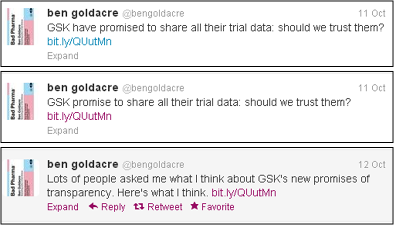
The reason I have picked Ben for this blog is that he is a good example of someone who is willing to repeat his message (but not in a spammy way), a simple example of this is where he tweeted a link to his article around Glaxo SmithKline.

The tweets linking to the same article were sent out at 9:37pm and 10:57pm on the 11th Oct and also 10:36am on the 12th (oldest one displayed first):
The response by hour shows how the third Tweet has almost double the response of the initial tweet (there were sent at almost the same time past the hour so a pretty fair comparison can be made between the two).  It's possible that just after 10:30 on a Friday morning is the perfect time to hit people on a mid-morning break looking for something interesting to read to distract them from work.
  Response by Hour to the link mentioned in the Tweets

There are other tweets in between these so it is not as if Ben is just hammering home a single point with nothing else to say.

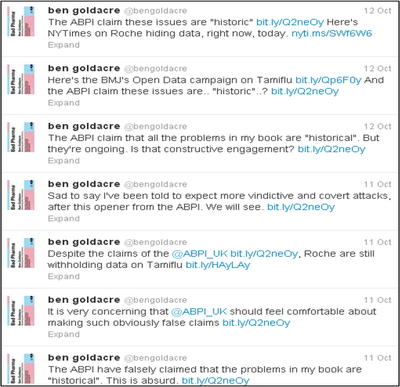
Another good thing that Ben does is not assume that anyone reading any single tweet will know the whole context of what he is saying, rather than just linking to something once and then sending follow up tweets talking about that subject, Ben includes the link for reference in each tweet (as seen below, again there will be tweets on other areas between these tweets).

A series of tweets around the same topic (most recent first), there's every chance that a follower could first be reading Ben's tweets on this subject at any point so the link helps to provide context (and drive activity).

If you're only following 10 people on Twitter then obviously this would be quite annoying but generally people are following 100+ accounts and not checking their timeline every 5 minutes so the risk of over-exposure is minimal even if I did see someone sarcastically tweet that they didn't realise Ben has a book out at the moment.

Find out more about how we can help you with data at www.analysismarketing.com

Dan Barnett
Director of Analytics


Thursday, 11 October 2012

It's not just what you say, it's how you say it

In previous blogs looking at the activity of The Times dropping the paywall an hour at a time for selected articles, I've looked at the value of resending the same/similar message.  In this example, I look at the fact that it's not just follower volumes that's important it's relevance (and also the message itself).

In a piece on the recent sponsorship deal with Wonga for Newcastle United, George Caulkin rails against the increasingly depressing impact of business on football.  This was sent at 4pm on Tue 9th October with the article being free to view between 4pm and 5pm
This was retweeted by a few other people but as of 4.30pm had only had a few hundred clicks even though George has over 34k followers (not a bad resposnse for a tweet though).

By the end of the hour though, the link had been clicked over 2,600 times.


This was due in part to George promoting the article again with a follow up tweet:
This tweet was then retweeted at 4:42pm by Joey Barton who has 1.7m followers, creating the first of the two large spikes.  Joey had already promoted the article with the direct link (and had some Tweets back and fore with George).

The second spike was due in part a tweet at 4.52pm from Mirror reporter Ollie Holt which both praised the article and also reminded people that there was only a few minutes to go before the article was no longer free.
Despite the fact that Ollie Holt with 154k followers has less than a tenth of the followers of Joey Barton, it would appear that Holt has generated a greater response.

This will be for a number of reasons: the piece is personally endorsed rather than just retweeted (where it will appear as coming from George Caulkin with just details of 'retweeted by Joey Barton' at the bottom) and there is also a direct call to action: 'Read it quickly. Only free until 5pm'.

As mentioned in other posts, the details above are for visits using the Bitly link mentioned in the tweets, there will be cases where people have found it themselves or choose to link directly without the Bitly link so these figures are more the impact of initial tweets not the overall activity to that page.

It can sometime seem like Social Media is a whole new world and all the rules of marketing have changed but that's often not the case.  As can be seen from the impact of the enthusiastic endorsement of Ollie Holt's tweet combined with the time limited call to action a lot of the traditional methods of generating response are still valid.

Dan Barnett

Director of Analytics

Wednesday, 10 October 2012

A great example of Twitter usage

I recently followed a restaurant on Twitter who then quickly replied with a Direct Message containing a link to get 50% off a meal there (I've blanked out the name).

This use of social media is even more impressive considering it is a single restaurant rather than a chain but seems to be an organisation that understands the benefit of striking while the iron is hot to have an interaction with a potential customer.

With any kind of offer/promotion the key thing is to be able to monitor its effectiveness, if all of a sudden all your regulars are bringing this in then it's costing you money.  The kind of thing you'd want to be able to track  would look something like the below:


Where the first 4 columns are completed when the person calls to book and the last two when they ask for the bill.  This back end analysis is the difference between just saying 'Loads of people used the vouchers' and knowing how the typical voucher user compares to a typical normal customer.

If for example you are getting a disproportionate number of people coming in and spending little or nothing on drinks then that makes a huge difference to the profitability of the promotion.

Obviously not every company can offer 50% off for everyone who follows them on Twitter but there is something to be said for making some kind of contact to people who follow you.  Depending on the volume of followers this can either be an automated response or have a more tailored personal touch to show you've thought about what part of your offering you think the follower might be interested in.

Dan Barnett

Director of Analytics