Tuesday 21 April 2015

Blood Stocks - Examples of good and bad visualisation

This is probably the first blog for some time that isn't football related in some way or another and is looking at the different ways the various parts of the UK show current blood stock levels - I was tempted to title it 'Getting blood from a (Steve) Stone', but felt that was a bit niche.

In some respects Blood Donation follows a lot of the traditional methods associated with Charity activity (positive success stories, the emphasis on the difference you can make etc.,) but where for most charities the aim is getting someone to make a donation (or even better set up a direct debit), for blood donation the barrier is even higher as it involves the potential donor's time and effort as well as a certain amount of physical discomfort.

The upside is where with some charities you may (probably falsely) wonder what difference your donation will make, by giving blood you can be sure that it really is something that is necessary to save lives.

This blog compares how the 3 organisations in mainland UK display details of their current stock levels, and where what should be a fairly straightforward visualisation seems to get a bit of a mangling.

The body for England & North Wales blood.co.uk shows 3 static charts when visiting its Stock Levels page:
Current Stock Levels: Not initially sure what figures relate to as next chart details number of days worth of stock.  Also the use of 3 decimal places is odd (unless it is using the continental style of a full stop rather than a comma to mark '000s so the guess is there are around 11,000 units of O+ blood available).  Also, not the worst crime in the world but 3D effect unnecessary as we'll see when looking at the Welsh version.


Current Days Stock: Fairly straightforward chart but again not sure about need for decimal point or 3D effect


Current Total Stock: These figures look like a sum of the current stock levels (the first chart above) for each individual day.  Having the Y axis start at 22 highlights the relative drop in supply around Christmas and New Year.  This could be argued as misleading but in this case it does help highlight the relative drop beyond the normal 'safe' levels of supply at that time of year.
For the Welsh Blood Service, they've just gone for 1 simple chart:
Days Supply remaining chart: Nice and simple, rounded to the nearest half day, colour coded and also displaying the figure. Green= Normal levels, Yellow: Amber warning (presumably under 7 days).  Chart as at 21st April shows AB- as red with 3.5 days stock.

The Scottish Blood Service go for a more infographic type approach:


Scottish Blood Stock Levels: There are several issues with this way of representing the data - Actual figures are only available if you hover over (or click on) one of the images.  Also the amount in the blood bag doesn't seem to obviously represent the amount available e.g., in the image above O- is 5.9 days and O+ 5.4 days.  Also AB+ has significantly higher days supply than other groups but is at the same max level as B+ and AB+.  This however, like the Total Days Stock chart for England is where you might want to deliberately give a certain impression, if you as a potential AB+ donor know that they are currently extremely well stocked for this blood group, it could make you less likely to donate, even though that surplus level may only be temporary.
Aside from the visualisations, it is also worth pointing out the issue of borders between the organisations, some people may be aware that there are now multiple bodies dealing with Blood donation but this was a surprise to me (I've never had to give much thought to the devolution of such processes) and something could be done on all the sites to direct someone to the correct area if they enter an address that is better suited to one of the other organisations especially from Blood.co.uk where it isn't obvious it is now only dealing with part of the UK e.g., you enter Newport (Gwent) on the site and currently get told that nearest location is in Somerset.

Overall, for me the image from the Welsh Blood Service is by far the best representation of the data, it gives the information clearly in a format that can be understood easily and colour coded to flag up particular Blood Groups with immediate problems.
--
Dan Barnett

Director of Analytics
Analysis Marketing Ltd


Twitter: @analysismktg 

Friday 23 May 2014

Get More From Data - Event Review

Wed 21st May saw the first of our 'Get More From Data' events which was held at Browns Courtrooms near Leicester Square.

The aim of the event was to get beyond the buzzwords often associated with the analytics industry and look at some practical applications of data and some of the tools that will be enabling this.

First up was Richard Lewis from Model Citizens, talking about the 'Statistical challenges of Big Data'.

Richard described how the ever increasing rise in data volumes required a slightly different approach to more standard methods of passing through the whole dataset multiple times to be able to calculate statistics required for modelling but how it was possible to have a situation to be able to analyse and model where the whole dataset needn't sit in the same location.

The next speaker Simon Field from Revolution Analytics whose presentation followed on neatly from Richard's in that it went on to describe the ever increasing rise in R and how the fact that it is Open Source means that new techniques and set routines (packages) are created at a far greater rate than you'd get with a traditional software vendor.

The extra layer that Revolution Analytics brings is the scalability that is not available with standard R, with the ability to run using multiple cores along with enhanced versions of R packages.

After the break, was a presentation by Dan Barnett from Analysis Marketing/Analysis Recruitment talking about the required mindset of a modern day analyst.  The presentation focused more on attitudes required rather than skill-set.

Dan talked about how it was important to have an inquiring mind, to be able to think like a customer as it's people's behaviour that ultimately you're trying to understand and it's not just numbers on a page.  He also stressed the need to be questioning of any figures you get, to try and break them to see if any issues exist.

Dan also gave a few practical examples of how with the increasing availability of Open Source tools (R/Tableau Public etc.,) along with Open data such as that available from Census/Government sources, it was easier than ever for an analyst to prove they truly understood data and analytics and it not just being a case of sticking some keywords on a CV.

Next up was Lee Witherell from Fuel UK (part of communications agency Engine).  Lee talked about the increasing number of touchpoints an organisation might have with a consumer, how our lives now are dominated by 'looking at rectangles' from smartphones to tablets to TV.

Lee mentioned about the trade off consumers are face with between getting a service (examples included an App created by BUPA) and providing some data in return along with the rise of the 'Quantified Self' (see links at end of this blog).

The final presenter was Scott Lutz from Alteryx whose presentation brought together a lot of the themes mentioned in previous presentations.  Alteryx provides an easy to use workflow system to enable users to integrate data, analyse and then output to a range of sources including Tableau/Qlikview along with integration with R, this process means you're not left with a situation where a project might be split into silos where people have their own way of coding and documentation often sketchy.

With the ever-increasing rise in Analytics, tools like Alteryx are going to be vital to provide tools that are analytically minded but not necessarily 'Data Scientists' can use.

We'd like to once again thank all those who attended and the speakers for coming along, it was great to see how in practice tools like R and Alteryx and changing the analytics landscape.  If anyone is interested in seeing what Alteryx can do, they can click here to download a 14-Day trial.

Lee mentioned a range of sources in his presentation around visualisation and the 'Quantified Self' and has kindly provided us with those below:


Thursday 10 April 2014

Away Fans - How would you spend £200k

I was thinking about writing a piece about away fan activity in the Premier League anyway but then earlier this week Southampton announced they were drastically reducing prices for their final away game of the season at Swansea.
Southampton announcing the discount on Twitter earlier in the week
Much is made on their site of it being a chance to ‘give back to fans’ but I’m a cynical guy and also know about the Premier League’s Away Fan Initiative.  It’s often referred to as the Away Fan’s Fund (see BBC article) although that’s slightly misleading in that 'Fund' suggests some sort of ‘charitable’ donation from the Premier League, when in reality it’s a plan for all 20 Premier League sides to commit £200k each per year of their revenue for this and the next 2 seasons (so £12m in total) on the Away Fan experience.

There's a couple of reasons my hunch Southampton's activity is a 'Oh Shit, we've got to spend this money' rather than a planned approach.  The first is that coach travel goes on sale 6 days after the tickets which seems odd.  The second was this forum piece I found which details a response from the club earlier in the month to a Southampton fan:

I can advise that the away supporters initiative was created for clubs to use to improve the experience offered to visiting fans. This could be used either for our supporters travelling to other clubs, or supporters visiting us. 

The £200k was not a donation by the Premier League to all clubs in the league, this is a top end figure that they suggested should be put aside to improve this experience. The £200k is paid for entirely by the club. 

Currently SFC have put money into improving the away fans concourse areas and provided supporters with a family fun day as part of the Fulham match day experience. 
We are still looking into further options for this, when decisions are made they will be announced on our website. 

Knocking £30 off the ticket price, heavily subsidising coaches and offering a free meal means that this will cost Southampton around £60k in tickets alone for 2,000 fans and possibly closer to £100k overall depending on cost of coaches.  If this gesture is above and beyond the £200k fund then I'm happy to stand corrected and not be so cynical in future,

This ambiguity of ‘Away Fan Experience’ has probably in part led to a wide variation in approaches from clubs, some have kept it simple with regular ticket discounts while others have taken a more proactive approach and others have seemed to sit on their hands.

The Football Supporters' Federation have played a large part in getting this initiative set up and have details on their website of what some clubs have said they will do but I've also found a few examples from Fans Forums/Supporter Groups that highlight the vastly different attitudes to the initiative.  It's not meant to be a comprehensive list or bashing certain teams but highlights that even something as seemingly straightforward as this ends up with a dozen different solutions.

Manchester United at their Fans Forum had this:

MB outlined the away fans’ initiative. Each club has set aside £200k. The Club could spend this money on its own fans travelling away, fans visiting Old Trafford or a combination of both. 
...
Kiosk vouchers for away grounds were discussed, as was the availability of transport for the disabled. But the most popular idea was a £5 discount on the cost of away tickets. The Club agreed to implement this and further investigate funding the remaining league matches that may not be covered (ie a £5 discount might just stretch to 16 games, assuming current allocations). 

This is the approach a number of clubs have had with a straightforward reduction in ticket price although some have given deeper discounts than others, the picture below is from a letter from Arsenal to the 'Spirit of Shankly' supporters group:
Stoke have given free coach travel for the whole season and other clubs have gone for bigger discounts (or free/discounted travel) for specific matches.  As a Swansea fan, I know the club have made a lot of effort with regards to the initiative and were probably slow to trumpet their work as I saw a greater amount of coverage of Newcastle and Aston Villa offering reciprocal price deals even though Swansea was the common link.

Aside from reciprocal deals, Swansea have tried to have some sort of 'Thank You' at every game, ranging from free food to a free programme to discounted travel and free scarves.  I appreciate the gestures and the effort made, but personally I'd rather the £3.50 (if full price is charged) that is being given to another club in return for a programme was used elsewhere as I'll discuss later.

Everton's approach to the initiative is quite different to a lot of other clubs (from a Shareholder's meeting with Robert Elstone, Everton's CEO):
We spoke for a while about this initiative and the different approaches that clubs had taken to investing the £200k per year that has been set aside by the clubs to enhance the away match experience. Mr Elstone reiterated what he had said in previous meetings that this is supposed to be about filling the away ends of grounds. He noted that the ticket price subsidy the Club had announced for our own fans accounted for about 25% of the total spend.
Additionally the Club would soon announce a new role of ‘Away Fan Ambassador’ who would be available 8am through 8pm on match days to support the needs of away fans including providing live updates (presumably through social media platforms) of things such as traffic and weather updates.
He is though really frustrated by the actions of what he called the ‘less proactive clubs’ who’d used the whole £200k to simply knock a few pounds off tickets for their own fans, especially those clubs who have a 100% away following anyway and so their actions are very unlikely to increase attendances.
He has (or will) asked the Premier League to be more specific about their expectation for the use of these funds as the scheme continues in 2014/15 and 2015/16.
This from a Newcastle Fans Forum in late Feb was also interesting:
TC(Fans Rep): "What is the Away Fans Fund being spent on?"

LM(Club Rep) explained that the Club has to disclose its spending in this area to the PL and will be doing so shortly. LM will also be attending a meeting with the PL and club supporter liaison representatives next week where this subject will be discussed and ideas shared.

The board stated that it does not agree with the concept of subsidising away match tickets as this simply means it has to hand money over the home club, which doesn't discourage it from setting fair prices. Instead, the Club has pursued reciprocal pricing deals with other clubs but that this still represents a loss of revenue for those participating, which is offset against the Away Fans Fund.

TC agreed with the principal of reciprocal pricing and thought it was a good idea.

The Club disclosed that a significant amount had already been spent on the visitors section at St. James' Park this season, with the Away Fans Fund designed to be spent on the clubs' own fans who travel and the designated away end in their stadium.

The Club is funding away travel for the Newcastle United Disabled Supporters Association (NUDSA) to Hull City next weekend, with tickets, travel, food and stewarding all provided.

Gareth Beard explained that NUDSA was unable to travel in large numbers to other PL away fixtures due to the lack of available space for disabled supporters.

The Club asked supporters to continue sending in ideas. The Club also noted guidance from Fans Forum members that discounted travel was not universally popular due to supporters who travel from different areas and on other forms of transport not standing to benefit.

Since the above, Newcastle have now set up £10 discounts for trips to Stoke and Arsenal, possibly like Southampton have realised they need to get the £200k spent.

Approaches by club therefore range from basic discounts to 'fan experience' activities to using some of the money to refurbish a clubs away end.  Fans who support Everton away on a regular basis might argue that they'd rather had the extra £50-£60 back in reduced ticket costs but at least Everton appear to have a coherent strategy as to what they are doing with the money rather than blowing it all in one fell swoop.

The moral of the story for me is that if you give clubs too much room to interpret what the reasoning is behind the initiative a some of them will look to tweak it to their own advantage.  Personally I'd recommend a simple plan where an extra category of tickets is set up and 16-21 year olds ticket prices are set half way between Adult and Child.  So for Swansea for example where Adult is £35 (for most games) and Child £17.50, introduce a £26.25 bracket.

Obviously not everyone under 21 is poor and everyone over 21 rich, but this seems to me to be a simple way of encouraging the kind of people you want to keep coming to matches for the good of the game.

Other Posts:
Match Predictions: Are you Smarter than Lawro 
--
Dan Barnett

Director of Analytics
Analysis Marketing Ltd


Twitter: @analysismktg 

Friday 4 April 2014

Football: Big Data and Small Data problems

Last week I attended the Sports Analytics Innovation Summit held at the Emirates which had a range of speakers talking about the use of data in a variety of sports and different areas such as performance, psychology and fitness. 

In his review Sky Sports' Adam Bate pretty much hits the nail on the head in that you need to actually apply the data not just collect it for the sake of it. There's no doubt that the use (or at least collection) of data in football is becoming increasingly prevalent but it's the 'So What' factor that's critical. 

I liked the story from a few months of Forest Green who are a Conference club ditching Prozone, not least for the use of the word 'malarkey' in the local newspaper headline (I imagine them outside the ground with a 'Down with this sort of thing' placard against the use of modern technology in sport).
Top 2 results for 'Forest Green Prozone' on Google, professional step in Feb '13 but binned by new boss in December after manager Dave Hockaday leaves 'by mutual consent' in October.
Some of the quotes by the new manager Ady Pennock make him look like quite a traditionalist:

"I am a great believer in what I see and my eyes don’t lie, so I don’t need a bit of paper...The most important stat is the scoreline and I don’t want Prozone for the sake of having it"
It might seem a bit backward but I'd rather someone had the courage of their convictions rather than spending money on a product that gathers dust just because 'it's what the elite clubs do'.

Clubs are at the stage now where they are facing both 'Big Data' and 'Small Data' problems and it's how they deal with these that will determine the level of advantage they get over their peers.  

Analytics is just another enabler like better training facilities, diet, sleep patterns etc., there's no magic solution but small gains can make big differences to final outcomes.

Big Data Problems
As a Data Analyst, I probably hear or read the phrase 'Big Data' a dozen times a day (almost as many times as I have to watch a presentation that has a YouTube clip of Moneyball included) and a lot of the time it's used like its predecessor CRM (Customer Relationship Management) as a buzzword to try and sell you something you don't really need or to make something that's relatively mundane sound a bit more interesting.

Ultimately it comes down to the fact that it costs very little to store information and has becoming increasingly easy to capture information, so there is the desire to capture as many things as possible as frequently as possible regardless of if it has any real value.

The most obvious example of 'Big Data' in football would be Prozone where each player (and the ball I'm assuming) are tracked 10 times a second (some systems in sports such as NBA track it 25 times a second) so a 95 minute match after injury time gives 1.3m records per match.  It's not small but nothing compared to what a web company may store.

Even the most data-savvy manager is not going to want to wade through that much data so it'll be the job of Performance Analysts (and Prozone themselves) to to try and gain insight from the data, naturally the first stop will be top level metrics like top speed, distance run, #sprints etc., but it'll be the ability to go beyond this and be able to interrogate the data in more detail that'll make the difference and is probably where the new Forest Green Rovers manager is coming from, if you haven't got the resource to even scratch the surface of what the data could tell you, what's the point in having it.

Similarly for training data, you may have GPS data, heart rate, saliva, sleep diaries but you need to be able to go from a bunch of data to something that can change what you do with players.

Small Data Problems
Football also suffers from 'Small Data' problems in terms of small sample sizes both in terms of number of matches and number of players involved.  If one player scores 10 goals in a season and another 13 which one is the better one?  Even if you factor in things like expected goals (chance of any shot being scored so an effort from 6 yards is different to one from 40 yards), you're still going to be left with a fair amount of doubt as to which will perform better next season even if any estimate is far better than just guesswork.

Where there is doubt, there is the overwhelming temptation to not even try and be scientific and just go on 'gut feel' which comes back to the '..my eyes don't lie' comment, even though it's incredibly difficult to be 100% objective.

One obvious issue is that of confirmation bias.  As a Swansea fan, a good example for me is Dwight Tiendalli but more well known examples would be Tom Cleverly or Martin Demichelis where they are expected to be terrible, so every bad pass or missed tackle is seen as confirmation of this and any good play conveniently ignored.  This isn't to say that people's opinions are necessarily wrong overall, just that in any given match, the presumption of failure is already present before kick-off.


There's been plenty of talk recently about over-playing players and injury and I had a look a couple of weeks ago at the link between playing time and hamstring injuries for a few high profile players, one of the charts looks at Mesut Ozil's playing minutes and injuries:
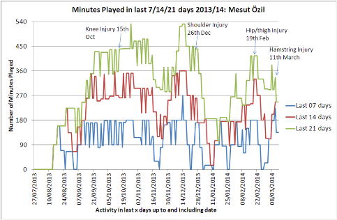
Ozil's playing minutes over the previous 7/14/21 days along with injury activity, was overwork after return from injury in Feb responsible for injury in March?
The problem here is that there is generally too little data (especially publicly) to have any real knowledge as to cause and effect (there's always the risk you're looking backwards for possible factors once someone is injured, ignoring the time they or others exhibit the same activity but didn't get injured). 

You may have a small pool of players who have started playing again after a relatively minor injury but how many of them then follow the same playing schedule as Ozil and also a similar playing style in terms of distance run, sprints etc., and a similar physique.  It was interesting to see some of the doctor's presenting at the conference talking about pooling data (anonymously) which would improve the situation and this is taking place at some levels within UEFA.

There's also the issue around short-termism, it may well be that a particular strategy/approach is the best over a longer period of time (e.g., limiting a player's match time) but a lot of the time anything more than a fortnight away might be classified as 'long-term planning'.

If you imagine Wenger deciding whether or not to start Ozil against Bayern on the Tuesday after playing him for 90 minutes against Everton the previous Saturday:  at what level of likelihood of injury would he decide not to play him? 5%,10%,20% 50%? And when he does get injured is that particular instance bad luck or bad planning?

Just buying a piece of software won't solve your problems, but just as surely it's impossible for any one person to be able to collate, retain, process and analyse all information that may be useful in creating better performance.

Analytics is taken most seriously at the elite clubs but I'd argue that the greatest incremental benefit would be for Championship (or ambitious League 1) clubs, there's enough money there for it to be worthwhile and also you're more likely to be doing something different to your peers.

Overall, clubs are faced with the dual issues of having 'too much' data in some instances and 'not enough' in others. This is where the skill of an analyst comes in who can process the data, find the insights and present back in a way that actions are actually taken off the back of the data.  They'll also know the difference between what's interesting, what's actually important and what is just noise.

For me a performance analyst and a statistician are needed to work together to combine technical/programming/statistical skills needed to work the data, in tandem with someone who will be more closely involved in the application of any findings (if you can find someone who can do both, fantastic, make sure they never leave).

I'm naturally biased given my background, but the obvious solution for me is for clubs to bring in Data Analysts for the off-field work (Season Ticket Analysis, Club Shop, Social Media Analysis) but to free up some of their time to look at on-field data.  This way you have someone 'paying their way' even before they get to the football data.  I'd argue they'd probably contribute a greater amount to the bottom line if working fully on football data but that may be too much of a leap of faith for some clubs, at least for now.  

Other Posts:
Match Predictions: Are you Smarter than Lawro 

--
Dan Barnett

Director of Analytics
Analysis Marketing Ltd


Twitter: @analysismktg 

Wednesday 23 January 2013

Comparison of Opta stats providers

It may just be self-selection based on the kind of things I read, but there seems to be an ever growing interest in data in football and the subject appears to be moving away from the niche into the mainstream with increasing mentions in the press such as a recent article in The Guardian.

This is partly due to more and more sites making use of data in football, in particular from Opta.  In this post I'll look at the pros/cons of a number of sites/apps that use Opta data and their comparative strengths and weaknesses.

When Swansea City reached the Premier League with promotion in May 2011, I decided to set up the blog www.wearepremierleague.com to combine my interest in stats with that of the Swans. Generally speaking there is a paucity of (publicly available) data around activity in lower leagues - although credit must go to Ben Mayhew for his attempt to rectify this at Experimental 361. The level of detail publicly available for the top leagues in Europe however is still far beyond that in the Championship and below.

Guardian Chalkboards
When I started out, this was one of the few resources about and had the advantage of being free and web (not app) based.  I won't go in to too much detail about it as its sadly no more (possibly ahead of its time?) but the thing I liked most about it was to be able to visualise the activity with regard to where on the pitch it took place.

The image below shows a Swansea goal against Blackburn where every Swansea player touched the ball in the move.
The addition of squad numbers to activity gives a level of detail not available anywhere else I've looked
Stats Zone
The demise of Guardian Chalkboards a couple of months into the season was the nudge I needed to get an iPod Touch to be able to use the Stats Zone app.

Stats Zone is great for both looking at the top level stats (e.g., Shots per Team) or delving in to the detail of a particular match (e.g., Long passes by a particular player).
Example of a Stats Zone Screen shot, in this case comparing the Aerial Duel activity of Peter Crouch with the Stoke team as a whole
Stats Zone is produced in conjunction with FourFourTwo magazine and their website includes blogs produced by Opta and Zonal Marking and others.

I combined my interest of football with that of data analysis in the creation of a Premier League Review dashboard, which is a interactive presentation taking a number of images from Stats Zone.

WhoScored.com
Whenever Swansea are linked with a particular player (usually from La Liga), WhoScored is the first site I go to as it has in-depth details for any player across the major European leagues:
WhoScored has details both on overall activity for that season as well as the ability to drill down in to activity for a particular game
WhoScored also has a fairly comprehensive list of stats for any particular match with the ability to order ascending/descending on these metrics for each played within a team (Long Balls, Chances Created etc,.) and also blogs from a number of respected writers.

Squawka Sports
Squawka.com is to some extent a cross between Stats Zone and WhoScored in that you can look at activity of individual players across the season as a whole, but also look at specific types of actions graphically for a specific player in a particular match e.g., Canas' passes vs. Malaga
Squawka goes for a dashboard approach for presenting a lot of its data
EPLIndex.com
The level of detail available in the sites/app mentioned above will be enough for the majority of people but for those wanting even more, there is the pay-for site EPLIndex.com (£3.95 a month/£40 a year) which has even more detail.

Where WhoScored for example might have total passes and pass accuracy, EPL Index will break this down even further e.g., Passes/Accurate passes in Own Half/Attacking Half/Final Third:
EPL Index Screenshot - huge amount of data across numerous tabs
The level of detail of this data is pretty much the same as the release from Opta/Manchester City of the summary stats for the 2011/12 season, just not in a single spreadsheet.

One of the other advantages of EPL Index is that it has data for multiple seasons making comparisons such as one I did recently comparing Danny Graham and Kenwyne Jones possible:
Example of the kind of thing its possible collate using data supplied by EPL Index
As well as the option of subscribing to stats, for those who just want to read about stats and football the site has an ever growing number of authors who use the data to write and publish their own analysis to a level of detail which is arguably a depth of analysis rarely seen anywhere.

Relative Strengths and Weaknesses of each source

Stats Zone - Strengths:
  • Ability to visualise activity e.g., location of Shots/Interceptions etc., 
  • Includes simple top level summaries e.g., total tackles made ordered by all players not split by team as is the case in the other sources
  • Ability to drill into data within the game e.g., compare first 62 minutes with last 28
  • Ability to create bespoke comparisons across matches/teams e.g., Chances made by John Walters in first 30 minutes vs. Aston Villa compared to Chances made by Stoke vs. West Brom  
Stats Zone - Weaknesses:
  • Apple devices only - no Android or Web version
  • Lacks ability to see multiple stats simultaneously e.g., Tackles/Passes/Shots per player
  • Doesn't have stats collated across a season

WhoScored - Strengths:
  • Includes data on all major European Leagues and Champions League
  • Easiest site to navigate around between stats for Team/Player/Match
  • Best for comparing statistics across teams, form/shots per game
WhoScored - Weaknesses:
  • Little visualisation of data - there is a nice image of shot areas but not the chalkboards such as those from Stats Zone/Squawka
  • No ability to analyse activity within a game e.g., compare 1st and 2nd half stats

Squawka - Strengths:
  • Has ability to easily track metrics for a team or player for a single match or across season
  • Includes heat maps of activity by player/team
  • Ability to drill down within part of the game (currently 5 minute intervals)
  • Lots of charts as well as raw data, multiple options for visualising the same data
Squawka - Weaknesses:
  • Doesn't have the same level of detail of stats readily available as other sites although only likely to bother the really in-depth user
  • Good to have charts but some could be better e.g., if a player has played in 15 of 22 league games only stats for those 15 shown.  Personally would like to see the blanks to know where over the season that player hasn't featured
  • Stats Zone plots chalkboards from the point of viewing of the team your analysing attacking from left to right, Squawka plots them with Home team playing from left to right which can be annoying when trying to compare areas of attack/passing

EPL Index - Strengths:
  • Most in-depth of any of the data sources
  • Has league data going back to 2008/9 season
  • Top-Stats feature gives ability to find best players across a range of metrics with ability to filter by those playing at least x minutes in a game or total minutes across a season (e.g., avoids problem of someone coming top in pass completion % with 1 pass from 1 attempt)
EPL Index - Weaknesses:
  • Pay-for site
  • No ability to analyse activity within a game
  • Generally best thought of as a source of data from which you create something yourself 

Turning Data into Insight
Although each of these companies is taking the same (or at least similar data) from Opta, it can be seen that they have each used it in different ways and are all still improving as time goes on. Eventually I'd imagine that one of these sites (or a newer entrant such as Sky) will bring all these parts together, possibly also including video for a complete experience.

As an example, a lot has been made recently about David de Gea pushing balls back into dangerous areas when he makes a save, the raw data will only tell you so much but to be able to view all his saves or saves where there is a goal in subsequent 10 seconds would give an even more detailed picture.

TV rights are far to precious to be given away but the ability to create your own highlights package (e.g., All chances created by Pablo Hernandez, with approx 10 seconds of footage per chance created) could take interactive entertainment to a new level.

Other Posts:  Man City and TwitterTwitter and Bookies - A Case Study , Premier League Weekly Review

Monday 21 January 2013

Manchester City and Twitter

Following on from previous posts looking at football and Twitter, this current post looks at some of the activity on Twitter from Manchester City. Man City are current Premier League holders and arguably the richest club in the world so to some extent getting an extra few retweets isn't the most important thing for the club.

That said, with Financial Fair Play being introduced (where clubs have to sort-of be self-sufficient, although as it involves UEFA who knows how it'll actually play out), the club needs to maximise its off-field revenues and Social Media will naturally be part of that.

Man City currently have almost 680k followers and have the fourth highest following in the League behind, Arsenal, Chelsea and Liverpool (Manchester United are currently not on Twitter which is presumably a strategic decision but would likely gain several million followers within a matter of hours if they ever decide to join, such is their global reach).

I've mentioned in a previous blog about 'Sweating the Assets' as an organisation such as Man City will have huge amounts of interesting content but as people are wary about repeating a message for fear of annoying followers quite often the value isn't maximised.

Man City in part have taken this on-board with the example of promoting a video of one of their players John Guidetti who has just started playing again after injury:
Man City tweeting a link to the same article 3 times over the space of a few hours
As seen previously when looking at response to tweets from other accounts, response drops off dramatically within a matter of minutes so there's no reason to worry too much about over-promoting when mentioning the same thing 3 times over the space of 9 hours, there's a drop off in number of retweets but not the levels that you would see if you were repeat mailing the same people.  It also makes sense for an organisation that's looking to promote itself globally to take different time-zones into consideration.

The one thing I would suggest however is adding a dummy part to the URL so the shortlinks produced for each of the tweets are unique to give a true understanding of response per tweet.  There's more details on creating unique links in this blog.

Although the example above shows that they are considering multiple posts, generally speaking, items get posted only once, below are a couple of examples of recent tweets that have sufficient interest to be reposted but which were only posted once:
Recent Man City tweets showing the rapid decay in click-through, the Gallery tweet generating almost as much response in the first 7 minutes as the subsequent hour
Twitter is very much a 'blink and you'll miss it' medium and generally speaking most users won't have set up lists of key accounts such as the football team they support so there is real value in repetition along with considering peak usage times across the globe.

Friday 7 December 2012

How BBC Breaking News Track Individual Tweets

In a previous blog I mentioned how it's possible to separately track the activity of numerous tweets that all point to the same page by adding dummy text to the web address e.g., www.analysismarketing.com/#blogtest

This means when you use a tweet shortening service (either directly within Twitter or using a tool such as Bit.ly) each unique address e.g., /#01, /#02 will be given a different shortened link.  Without this, every time you tweet a link to the same page it generates the same shortened link making it difficult to attribute activity to individual Tweets.

A good example of an organisation that puts this in to the practise is the BBC with the @BBCBreaking account.  Depending on how big a story is, there might be several tweets linking to the same article.  An example of this was the arrest of Max Clifford.

@BBCBreaking sent out two tweets, one at 1:11pm and one at 1:19pm on Thursday 6th Dec.  Both were to the same webpage but as there were dummy details added, they have separate short-codes:
Click-Through volumes from the two tweets.  The first is around 40% higher overall but the response curves have similar patterns
The two tweets have different addresses: http://www.bbc.co.uk/news/uk-20627765#TWEET424921 and http://www.bbc.co.uk/news/uk-20627765#TWEET424943 but go to the same physical page (i.e., everything from the # onwards gets ignored).

If you're promoting the same article/page on numerous occasions, this method is a way of tracking the individual piece of activity that has driven that click.  This principle works across wherever you put the weblink (Twitter/Facebook/LinkedIn/Email etc.,) and gives you a lower level of detail than would otherwise be available.